These are the samples featuring the symbol of sun and moon, which are already vectored using Illustrator:

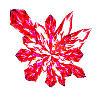
About the image above, with the thinking of creating something new and original, i used many crystals-like objects combined with each other to create the shape of the sun. These crystals are in red, dark red and violet, which are the colors of heat and fire, presented on a white background. I used photoshop to design them. By using blend option and many layers with many combination of gradient colors, i was successful in creating those them with a quite satisfying result.
The design will give the impression of these crystals burst out from the core, causing impact just as an explosion. This idea is given through many incident and terms related to the sun like "big bang", "nuclear core", etc. Furthermore, the design's made of solid lines. The goal is to make viewers feel the strength of the sun.
More than that, I made many layers of crystals by changing their sizes, brightness, and colors, i want to give this image a little 3D effect.
The crystals's positions are not laid with balance, because if they make a logical shape, it will ruin the "motion" in the image, and furthermore, it will lose impact.

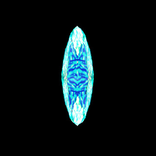
This is a opposition of the sun image. As hard to recognize as it seems, this is the image of moon. While I wanted to give it a whole new look, it has many opposite points compared to the above sun image.
I tried to find a way to avoid the typical moon image, and the result is what you are looking at: this moon is viewed directly from its front, not from sides. Now, let's just ignore scientific fact that the real moon's original shape is not like that, or that shape is just because of cloud, etc. Anyway, this time the moon is made of ice, with silver and light blue color - completely different from the sun above. Those colors can represents elegance, pure and night, which are perfectly suitable here. They also represent an image of a frost moon - a mystical image which everybody man know in tales. This image is showed on a dark background.


 I changed the background to black because it can help the sun easier to be seen . Then, i added some fire effect, along with some adjustment in the color. By giving some lighter color in the center, it gave some more "heat" to the sun and make the reflection of the crystals more beautiful. The fire around it really helps. With these improvement, i believe that the sun is now better than ever.
 On the moon case, I gave it a starry background, along with some lens and glow effect. The glow is in light purple, which can give the image a mystical feeling. Talking about mystical feeling, it is now amplified even greater by adding some fog effect. The fog is also to strengthen the moon's "coldness".
