Saturday 30 May 2009
It's not just design now...
The design is based on an idea of combining complex classic beauty with modern shiny feeling. The textures carry flower patterns, which are really famous in the past, however, the lines, lighting and shapes have been modified to be more trendy. Even though they are captured in rounded squares, the whole screen doesn't gives a restricted feeling at all. By mixing those textures with ink brush as background, not only do I want to furthermore synch those details with each others, but the overall feeling of freedom is also created.
Link:
http://unix.rmit.edu.vn/~s3183672/web%20pro%20super%20back%20up%20plan/elements/friendGathering.html
Sunday 25 January 2009
Toilet - Is it bad?
The first time I work with web designing... What should I say... It's simpler than I thought in coding, yet the design process takes more steps and requires more accuracy. This website is created to practice with CSS, the theme is, surprisingly and unexpectedly, "toilet" :"> . Actually, this website is like a corner of a bathroom, decorated in simple Europe style. It is presented in a light blue background, with a little fog to add more wet feeling.
While it's not very impressive, and the impact is not very strong, I wanted to design something relaxing so that viewers will feel convienent when looking at the design. Without strong strokes or complex mixes of colors, this website is as simple as possible. Hope you enjoy it.
URL: http://unix.rmit.edu.vn/~s3183672/CSS%20and%20HTML/zengarden-sample.html
Friday 5 September 2008
Modernism

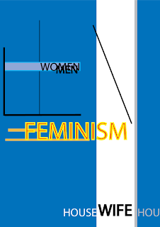
This time, i take modernism as the topic for my design. The image you can see above is created to express the influence of feminism to our modern world and how it changed the position of women.
Talking about modernism, we should be able to remember some keywords like "straight lines, vertical/horizontal," etc. In order to fit the theme into this style smoothly, i had to do some researches. The lines are not only those black hairline strokes you can easily see, but the colors are positioned so that the modern feeling can be felt stronger.
On the other hand, motions are all over the design, and it's one important factor in modernism. It doesn't require too much concentration to notice those "movement". Obviously, we can see the "Feminism" move from left to right, and this movement link to another change in the image, which is, again, easy to notice. From this point on, imagination is required to see the chains in motion. The black line is pushed by the word "Feminism" and it crashes "women", which result into separating "men" from "women". I wanted to point out that thanks to the feminism, roles in society is changed, women is not dependent on men any longer, and through those changes, positions between men and women is different too.
The movement of "feminism" doesn't only limited to moving the line, it also moves the big color part, open up a big "WIFE" word, and kick those "house"s words away. The meaning is just as it is, no more housewives, and it the "feminism" has opened a new page of history.
Those motions can be confused to be seen at first, but it's not complicated. Furthermore, all of the components are laid carefully so that there will be enough white space and balance in the design.
Friday 29 August 2008
the universe hand

I wanted to create an image of a unknown force coming from another world, and talking about a mysterious world where we human still know little about. An image of a cold hand reaching out from a white hole from the darkest space of universe may give chill to someone. The depth can be felt thanks to the hole and the hand, as if you can be touched from the picture if looking at it for some time. The hand looks as if it's going to move forward, also the light support the realistic and depth of the hand effectively. Furthermore, a balance between black and white in this design is created with care so that it won't ruin the layout. Simple as it is, design's rules are followed carefully and the piece's effect is carried out by using as less elements as possible.
Friday 22 August 2008
DVD cover - Fearside
This DVD cover is for a movie ( a make up movie :D) named Fearside, and it's also the Assignment 2B. I took proud in this piece and post it here as a part of my portfolio.

The contents of this DVD is already given, so i will only discuss the technical steps to make this piece along with some design elements in it. The back ground is created using Cloud in Photoshop and overlayed by 2 other gradient layers to create the color effect. This background can also give a deep feeling effectively. As you can see, the porpotion of the elements here is displayed nicely. The depth can be felt with ease.
Next is the text "Fearside". This one took me a huge amount of time to create it. I used 21 layers to create the text along with its own background. The process is, quite simple but required many steps and tools. I gave the text separate layer and used smudge tool to give a creepy feeling. On another layer, i gave them layer effects such that inner shadow, beveal, and gradient. layer masks are used here and thanks to them, better look can be seen. I gave them 2 layers as blending colors and 1 layer as shadow. The steps are not over, they are duplicated and stretched to give a liquid shadow behind.
The girl face is adjusted carefully to fit in the DVD, and i also added blood stains, or disease marks on her face. Whatever it is, the imagination of you who are viewers is important :). Those blood stains were created separately in a different psd file and blended into this piece.
The back cover and front cover has the same tone of color and background to give them unity in theme and feeling. Red is chosen as the main color here, because it represents blood, gore, pain and horror. It maybe is a little off topic, but i never liked red. However, if you are viewing this entry, take your time and look at my other posts, almost ALL of them have red tone > < this has been bugging me for sometimes, and somehow, i can't break change this. You may call it my style (just joking).
Sunday 17 August 2008
Terror

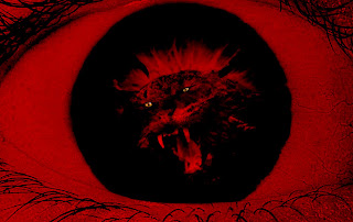
It didn't take me too much time to create this piece. I used only 3 images which is the eye, a cat and a buffalo skull, then i cropped the parts i want and bended them together. Then i add another layer to adjust the color and tone of the whole image. Adding some shadow and burn the image a little is done at last.
The image is simple and quite effective. The eye expressed the fear nicely, and the monster fits in it perfectly. The problem is it could be used better in a super natural thriller film, not a horror one, thus i didn't used it. Color is dark red, resembling blood and confusion. It can give a chaotic feeling too.
Saturday 9 August 2008
Global Warming series - 3

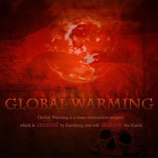
This design is created by combining multiple photos with each other to express a problem stirring our world these last years. With an abstractive style background, I wanted everyone see as many disaster Global Warming can bring to us as possible.
The main color of this file is dark red, representing heat and destruction. I used many images like fire, sun, desert in it to create a natural crimson red. The flame is applied here in order to draw out a tragic feeling, supported by the night star image, which is blended nicely to fit the fire.
Without death, it won’t be effective, or at least I thought so, thus adding a skull there helped this design really much. Not only it balanced the structure, but the skull also put some impact and stress into this design. A blurry dead forest can be seen if the viewers pay enough attention. Furthermore, thanks to the cracks, waste spaces are filled, and hardness, as well as a dry feeling can be felt effectively. The texts are created with care to fit in the images nicely and fulfill the meaning of this work.
Being designed with many similarities with a poster, this design is meant to be a warning to all of its viewers. it can displays many messages in one look and talk out various complex emotions perfectly.
Due to some problems, i couldn't used that design to submit for the second collage assignment, thus i changed a little bit in content, and this is the version i used to submit. As you can see, some details are changed, some are better, some are not good compared to the above. Anyway, enjoy.
