Friday, 5 September 2008

Modernism


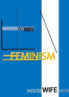
This time, i take modernism as the topic for my design. The image you can see above is created to express the influence of feminism to our modern world and how it changed the position of women.

Talking about modernism, we should be able to remember some keywords like "straight lines, vertical/horizontal," etc. In order to fit the theme into this style smoothly, i had to do some researches. The lines are not only those black hairline strokes you can easily see, but the colors are positioned so that the modern feeling can be felt stronger.

On the other hand, motions are all over the design, and it's one important factor in modernism. It doesn't require too much concentration to notice those "movement". Obviously, we can see the "Feminism" move from left to right, and this movement link to another change in the image, which is, again, easy to notice. From this point on, imagination is required to see the chains in motion. The black line is pushed by the word "Feminism" and it crashes "women", which result into separating "men" from "women". I wanted to point out that thanks to the feminism, roles in society is changed, women is not dependent on men any longer, and through those changes, positions between men and women is different too.

The movement of "feminism" doesn't only limited to moving the line, it also moves the big color part, open up a big "WIFE" word, and kick those "house"s words away. The meaning is just as it is, no more housewives, and it the "feminism" has opened a new page of history.

Those motions can be confused to be seen at first, but it's not complicated. Furthermore, all of the components are laid carefully so that there will be enough white space and balance in the design.

Friday, 29 August 2008

the universe hand

This piece was inspired when i wanted to create a DVD cover. At first, the Fearside's synopsis made me think that this is not quite a horror genre but somehow resemble a supernatural film, which is why i made this design. But looking back, i don't think it fit the brief, so it was left unused. However, the concept behind it is not just a plain abstract design.


I wanted to create an image of a unknown force coming from another world, and talking about a mysterious world where we human still know little about. An image of a cold hand reaching out from a white hole from the darkest space of universe may give chill to someone. The depth can be felt thanks to the hole and the hand, as if you can be touched from the picture if looking at it for some time. The hand looks as if it's going to move forward, also the light support the realistic and depth of the hand effectively. Furthermore, a balance between black and white in this design is created with care so that it won't ruin the layout. Simple as it is, design's rules are followed carefully and the piece's effect is carried out by using as less elements as possible.

Friday, 22 August 2008

DVD cover - Fearside

A DVD cover will be a critical element which will determine whether a customer will choose a movie or not. Sometimes, the DVD cover is more important than the content, because it can "lure" "innocent targets" into buying the product. This is especially important to a horror movie.

This DVD cover is for a movie ( a make up movie :D) named Fearside, and it's also the Assignment 2B. I took proud in this piece and post it here as a part of my portfolio.


The contents of this DVD is already given, so i will only discuss the technical steps to make this piece along with some design elements in it. The back ground is created using Cloud in Photoshop and overlayed by 2 other gradient layers to create the color effect. This background can also give a deep feeling effectively. As you can see, the porpotion of the elements here is displayed nicely. The depth can be felt with ease.

Next is the text "Fearside". This one took me a huge amount of time to create it. I used 21 layers to create the text along with its own background. The process is, quite simple but required many steps and tools. I gave the text separate layer and used smudge tool to give a creepy feeling. On another layer, i gave them layer effects such that inner shadow, beveal, and gradient. layer masks are used here and thanks to them, better look can be seen. I gave them 2 layers as blending colors and 1 layer as shadow. The steps are not over, they are duplicated and stretched to give a liquid shadow behind.

The girl face is adjusted carefully to fit in the DVD, and i also added blood stains, or disease marks on her face. Whatever it is, the imagination of you who are viewers is important :). Those blood stains were created separately in a different psd file and blended into this piece.

The back cover and front cover has the same tone of color and background to give them unity in theme and feeling. Red is chosen as the main color here, because it represents blood, gore, pain and horror. It maybe is a little off topic, but i never liked red. However, if you are viewing this entry, take your time and look at my other posts, almost ALL of them have red tone > < this has been bugging me for sometimes, and somehow, i can't break change this. You may call it my style (just joking).

Sunday, 17 August 2008

Terror

I intended to use this image as the main theme for my DVD cover, but without any deep meaning and impact, it was not used.


It didn't take me too much time to create this piece. I used only 3 images which is the eye, a cat and a buffalo skull, then i cropped the parts i want and bended them together. Then i add another layer to adjust the color and tone of the whole image. Adding some shadow and burn the image a little is done at last.

The image is simple and quite effective. The eye expressed the fear nicely, and the monster fits in it perfectly. The problem is it could be used better in a super natural thriller film, not a horror one, thus i didn't used it. Color is dark red, resembling blood and confusion. It can give a chaotic feeling too.

Saturday, 9 August 2008

Global Warming series - 3

Again, i'm back with a Global Warming topic. This time, a large amount of time and effort was spent to this design, and as the result, we can see a nice, stunning poster. With an abstract theme, i gave it multi meaningful messages along with the best look i could ever image:

This design is created by combining multiple photos with each other to express a problem stirring our world these last years. With an abstractive style background, I wanted everyone see as many disaster Global Warming can bring to us as possible.

The main color of this file is dark red, representing heat and destruction. I used many images like fire, sun, desert in it to create a natural crimson red. The flame is applied here in order to draw out a tragic feeling, supported by the night star image, which is blended nicely to fit the fire.

Without death, it won’t be effective, or at least I thought so, thus adding a skull there helped this design really much. Not only it balanced the structure, but the skull also put some impact and stress into this design. A blurry dead forest can be seen if the viewers pay enough attention. Furthermore, thanks to the cracks, waste spaces are filled, and hardness, as well as a dry feeling can be felt effectively. The texts are created with care to fit in the images nicely and fulfill the meaning of this work.

Being designed with many similarities with a poster, this design is meant to be a warning to all of its viewers. it can displays many messages in one look and talk out various complex emotions perfectly.

Due to some problems, i couldn't used that design to submit for the second collage assignment, thus i changed a little bit in content, and this is the version i used to submit. As you can see, some details are changed, some are better, some are not good compared to the above. Anyway, enjoy.


Saturday, 2 August 2008

Treasure our food!!!

I created this design from a mixing emotion due to various events of our world nowadays. As everyone knows, fuel , not just in VietNam, but on the whole world, has had its price increased surprisingly lately. Also there is a serious shortage of food occurring in many countries. Value of everything has been changed dramatically these day, and thanks to that i realized some thing, simple, but important.


The message is simple: "Rice is gold". This message is answered automatically in viewer's brain without difficulty after seeing the hidden text "What is gold", which is also easy to figure out. The pictures are cropped carefully for them to fit with each other perfectly. Furthermore, light is adjusted with much efforts to give out a golden radiance from the rice. It's just like the hand is holding gold, not just rice. I just want to emphasize the importance of every single drop of rice in this unstable era.

Really, i expected more from this design, but i can't find any better way to express the feeling as well as the message. Anyone has an idea of how to give better typography or where to put more text which will support the design? Please give me some advice. Thanks in advance

Friday, 25 July 2008

The BLACK HOLE

ok, let's leave our annoying global warming aside, since i bet you guys are getting tired of it already. Don't worry, i will have you enjoy "Global Warming" until you cry in near future :D. Enough with nonsense talks, this time we will have another topic to talk about.


The topic is Black hole. As you can see, what i tried to achieve is not a real visual of a black hole, but a artistic view of it. I used some elements of Indian's mandala as its theme, giving this design a cool look. All details are not clear and seems to be sucked into the center, this is to make the visual image of a black hole more clear, and i also don't want all of those details confuse the concentration of viewers. The lightning is also taken advantage of in order to add more impact to the design. I also put effort into the typography so that it can fit into the design with as less flaw as possible.

This time there is not many things to talk about because the contents of the design is clear, and there is no really special meaning behind it. I just think that it's a good design after all, which can be a newer view of the black hole.

Friday, 18 July 2008

Global Warming series - 2

This time is another poster for Global Warming. I will continue working on this topic for a while because it's a hot topic nowadays.

No more complex explanation about global warming because it was posted with details last week. We will take a direct look at the poster now:


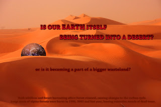
This time the main theme is desert. In the endless wasteland which in which exist no living creature, nothing else can be seen except for a dried dead Earth. The text itself talk the message behind this poster: "Is our Earth itself being turned into a desert or is it becoming a part of a bigger wasteland?"

That's right. The meaning of putting our Earth in such a large desert is not only to describe the current state of our Earth. As you know, talking about desert keep expanding and through global warming, plants can be harder to live, lands is getting worse and worse, and that's why i want to express how our Earth is on the verge of becoming a huge desert.

One thing which every people holds pride in our Earth is that it's the only planet which has life in this vast universe, or if there is another, we still don't know yet. In such a lifeless "desert", Earth is like an oasis with full of energy and filled with green and blue. Being dried everyday, it's inevitable that our Earth will, in near future, turned into a part of this hell.

The Earth is modified carefully so that it can has a natural gray color that fit in the theme. Its shadow is adjust with care too. I also added many effects and combined many elements to make it dried, which can only be seen on large mode. Efforts are spent heavily to the texts too, because i'm bad at creating effects for texts, thus i really tried hard this time.

The texts are put so that they can balance the Earth on left side, furthermore, with the relationship in size of those text, they can lead viewers' attention to the other from any direction. Their colors are for the same objective. In order to see them clearly, i advice watch it in large mode.

Friday, 11 July 2008

Global warming

Global warming is an emergency problem which the world is currently worry about. Although it's still doesn't give much serious damage to our living daily life, the day when we can't help but to regret about our childish thinking about global warming may be not too far away anymore. In order to point out my thinking as well as support the movements preventing global warming throughout the world, I made this design using Photoshop. First, let's take a look at it:


The general image which anyone can see is fire on the sea. The idea of firing the sea comes from the thought of "how can i give a really effective impression of heat?". Firstly, i have to recognize that the fire is made not too well. I've tried my best and this is all i could do using my little photoshop knowledge. But it's still enough to deliver a good image of "burning sea" to everyone. With the starry sky above, we can all know that this event take place in a night. The fire's light is bright enough to light up a night. All colors can give a hot, very hot feeling to viewers. The point here is to make as if the Earth is burning, thanks to an incredible heat. I also added a text "Global warming" there. The text's color is made carefully, and it has a nice effect of putting the text conveniently into the design. Furthermore, with that color, it's just like the text is affected by fire's light too . And that's it, not too complicated huh?

Although the concept is simple, i believe it's not too bad. Don't know what to add in order to make this image better, i would really appreciate any constructive comments about anything related to this design (typography, color, layout, anything). The effort i spent on this design is, as you can see, really worth to mention, even though i know that it's not very good to be praised. Thus i really need advices to help this design more effective and meaningful. Thanks a lot.

Sunday, 6 July 2008

This is another image of sun and moon. This time, the design is made in order to follow the given brief as strictly as possible. I will try to explain the image as detailed as possible, but first, let's take a look at it:


On the left side, the sun is presented on a white background, while the moon on opposite side can be seen without difficulty with a dark color around it.

The sun's rays are made using illustrator, with the shapes of many arrows. All of them are organized around the sun, giving unity to the design. Though saying that, a single arrow is in different shape and point on top with a 45o degree. With enough concentration, you will be able to recognize that the only that arrow is in black, which is the same color with the sun, all other arrows are in gray. My goal is to emphasize the connection between that arrow and the sun, and with ease, everyone can realize that is the male symbol. Taking about sun, we always mention strength, heat, greatness, which are all famous tributes make up a man. Thus giving the sun a male symbol here is an effective method to express the importance of the sun to this world.

The sun's black arrows is not just for the male's symbol. Giving that arrow a special importance, it can attract viewers' eyes to its direction as well. The arrow can help lead your eyes to the moon on the other side, and thanks to it, the connection between 2 images - sun and moon- become tighter and closer. In other word, that arrow is like a bridge lead you from the sun to the moon.

With eclipse form, the moon is in pure white. I gave some lines below the moon, with some special meaning behind it. First, i want to present a famous image, "bleeding moon". It's like when you see a moon between a valley, and see its light pour between the space between those mountains. This scene can only be seen with a best position and in a cloudy night. It's just like seeing an eye overflowing with tears, or ones can have another concept in their mind : "a bleeding moon". The second meaning i want to deliver to you can only be seen with a text "moon" cutting through those lines. All of those elements become one, and that is a female symbol. That's right, if we often talk about the sun as a strong and reliable man, many tales in China, Egypt and Greek consider the moon as a Goddess. Having a female symbol here not only help the moon more complete, but also balance the structure of the design itself.

Hope you enjoy the design.

Saturday, 5 July 2008

I'm going to write about Yokoo Tadanori - a designer whose name is on the list. In the essay, these 3 designs are going to be presented:


Thursday, 3 July 2008

Sun and moon completed version

There are many comments telling me that they have difficulty in realizing the meaning of my last sun and moon's design, and i think that it's necessary to improve the design in order for the sun and moon's image can be seen easier. The problem is that i don't want to change the concept of them, thus i decided to improve them and add some details so that they can resemble the sun and the moon more effectively. These are the results (note: these images are for the sake of improvement, not for the first requirement which Ms Stephanie gave anymore):


I changed the background to black because it can help the sun easier to be seen . Then, i added some fire effect, along with some adjustment in the color. By giving some lighter color in the center, it gave some more "heat" to the sun and make the reflection of the crystals more beautiful. The fire around it really helps. With these improvement, i believe that the sun is now better than ever.


On the moon case, I gave it a starry background, along with some lens and glow effect. The glow is in light purple, which can give the image a mystical feeling. Talking about mystical feeling, it is now amplified even greater by adding some fog effect. The fog is also to strengthen the moon's "coldness".

I believed that those designs are now better than their previous versions. Hope to receive more constructive comments ;)

Sunday, 29 June 2008

sun and moon

These are the samples featuring the symbol of sun and moon, which are already vectored using Illustrator:


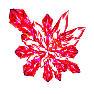
About the image above, with the thinking of creating something new and original, i used many crystals-like objects combined with each other to create the shape of the sun. These crystals are in red, dark red and violet, which are the colors of heat and fire, presented on a white background. I used photoshop to design them. By using blend option and many layers with many combination of gradient colors, i was successful in creating those them with a quite satisfying result.

The design will give the impression of these crystals burst out from the core, causing impact just as an explosion. This idea is given through many incident and terms related to the sun like "big bang", "nuclear core", etc. Furthermore, the design's made of solid lines. The goal is to make viewers feel the strength of the sun.

More than that, I made many layers of crystals by changing their sizes, brightness, and colors, i want to give this image a little 3D effect.

The crystals's positions are not laid with balance, because if they make a logical shape, it will ruin the "motion" in the image, and furthermore, it will lose impact.


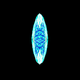
This is a opposition of the sun image. As hard to recognize as it seems, this is the image of moon. While I wanted to give it a whole new look, it has many opposite points compared to the above sun image.

I tried to find a way to avoid the typical moon image, and the result is what you are looking at: this moon is viewed directly from its front, not from sides. Now, let's just ignore scientific fact that the real moon's original shape is not like that, or that shape is just because of cloud, etc. Anyway, this time the moon is made of ice, with silver and light blue color - completely different from the sun above. Those colors can represents elegance, pure and night, which are perfectly suitable here. They also represent an image of a frost moon - a mystical image which everybody man know in tales. This image is showed on a dark background.